如何在Weebly中添加图标面板小部件
图标面板可帮助您以非常有吸引力的方式展示内容。 您通常可以在登录页面上使用它来显示网站上提供的不同类型的服务。 单个面板可以用作号召性用语框,您可以通过放置在旁边来显示多个面板。 虽然 Weebly 提供调用框作为应用程序,但具有相同列样式的图标面板将创建更吸引人的外观。
下面是图标面板小部件,我们正在讨论并继续阅读,以便为您的 Weebly建站网站创建这样的面板。

推荐:WordPress管理员主题Ultra
图标面板功能
- 您可以通过附加一段 HTML 代码来添加任意数量的面板。
- 用作单个或多个面板。
- 响应式设计,易于定制。
- 每个面板都包含一个很棒的字体图标、一个标题、一个段落和一个阅读更多链接或一个按钮。
- 即使内容高度不同,每列的高度也相同。
Weebly建站创建图标面板是一个两步过程——首先定义 CSS,然后添加 HTML。
定义图标面板小部件的样式
Step1 – 定义列和面板容器
让我们在一个名为 panel_container.
/* Equal column height container */
.panel_container {
display: -webkit-flex;
display: -ms-flexbox;
display: -ms-flex;
display: flex;
}

/* Four columns c1, c2, c3 & c4 */
.c1, .c2, .c3, .c4{
float: left;
padding: 20px;
width: 22%;
}
我们使用 flex 属性来保持父容器高度固定,而不管内部四个子列的单独高度。 我们为每列使用了 20% 的宽度以适应 Weebly 主题的宽度; 您可以尝试根据您的主题和您真正需要的列数自定义宽度。
注意 所有现代浏览器都支持 CSS flex 属性。 但是,像 Internet Explorer 这样的旧浏览器不支持此功能。
Step2 – 定义列的背景
现在已经定义了四个等高的列,是时候为每列定义背景颜色了。 我们使用了一些网络安全颜色,您可以更改为您需要的任何颜色。
/* Color definitions for each column */
.c1{
background-color: lightgreen;
}
.c2{
background-color: skyblue;
}
.c3{
background-color: orange;
}
.c4{
background-color: lightgrey;
}
第 3 步 – 为 Font Awesome 图标定义样式
我们为图标使用了很棒的字体,以便它易于使用,并且您将有大量图标可供您选择。 该图标被定义为一个 80px x 80px 大小的方形框,带有一些悬停效果。
/* Font Awesome icons stylesheet */
<link rel="stylesheet" href="https://maxcdn.bootstrapcdn.com/font-awesome/4.4.0/css/font-awesome.min.css">

/* Font Awesome icon definition with 80x80 box */
.icon{
background: rgba(255, 87, 34, 0.77);
color:#ffffff;
width:80px;
height:80px;
margin:0 auto;
border-radius:5px;
font-size:40px;
line-height:80px;
text-align:center;
}

/* Hover effect for icons */
.icon:hover{
opacity: 0.8;
background-color: #333333;
color: yellow;
}

/* Icon alignment */
.fa {
margin:20px 15px 20px 20px;
}
Step4 – 附加元素的样式
下面是标题(heading)、段落(para)和按钮(btn)等附加元素的样式。
/* Heading */
.heading {
font-size:20px;
font-family: georgia;
margin:20px;
}

/* Paragraph */
.para {
font-size: 16px;
font-family: verdana;
}

/* Button */
.btn {
display: inline-block;
padding: 6px 12px;
margin-top: 20px;
font-size: 16px;
line-height: 20px;
text-align: center;
vertical-align: middle;
cursor: pointer;
border: 1px solid transparent;
border-radius: 4px;
color: #ffffff;
background-color: #f1f1f1;
border-color: #4cae4c;
}

/* Button hover */
.btn:hover {
color: #ffffff;
background-color: #b6f0ff;
border-color: #398439;
}推荐:WordPress代码和文本替换插件Real Time Find and Replace
Step5 – 为小部件添加响应性
定义 CSS 的最后一步是使用媒体查询添加响应性,如下所示:
/* Responsive CSS media queries */
@media only screen and (max-device-width: 768px) {

.panel_container {
display: block;
}

.c1, .c2, .c3, .c4 {
width: 80% ;
margin:10px;
}
}
现在 CSS 部分已经完成,完整的 CSS 如下所示:
/* Font Awesome icons stylesheet */
<link rel="stylesheet" href="https://maxcdn.bootstrapcdn.com/font-awesome/4.4.0/css/font-awesome.min.css">

<style>

/* Equal column height container */
.panel_container {
display: -webkit-flex;
display: -ms-flexbox;
display: -ms-flex;
display: flex;
}

/* Four columns c1, c2, c3 & c4 */
.c1, .c2, .c3, .c4{
float: left;
padding: 20px;
width: 22%;
}

/* Color definitions for each column */
.c1{
background-color: lightgreen;
}
.c2{
background-color: skyblue;
}
.c3{
background-color: orange;
}
.c4{
background-color: lightgrey;
}

/* Font Awesome icon definition with 80x80 box */
.icon{
background: rgba(255, 87, 34, 0.77);
color:#ffffff;
width:80px;
height:80px;
margin:0 auto;
border-radius:5px;
font-size:40px;
line-height:80px;
text-align:center;
}

/* Hover effect for icons */
.icon:hover{
opacity: 0.8;
background-color: #333333;
color: yellow;
}

/* Icon alignment */
.fa {
margin:20px 15px 20px 20px;
}

/* Heading */
.heading {
font-size:20px;
font-family: georgia;
margin:20px;
}

/* Paragraph */
.para {
font-size: 16px;
font-family: verdana;
}

/* Button */
.btn {
display: inline-block;
padding: 6px 12px;
margin-top: 20px;
font-size: 16px;
line-height: 20px;
text-align: center;
vertical-align: middle;
cursor: pointer;
border: 1px solid transparent;
border-radius: 4px;
color: #ffffff;
background-color: #f1f1f1;
border-color: #4cae4c;
}

/* Button hover */
.btn:hover {
color: #ffffff;
background-color: #b6f0ff;
border-color: #398439;
}

/* Responsive CSS media queries */
@media only screen and (max-device-width: 768px) {

.panel_container {
display: block;
}

.c1, .c2, .c3, .c4 {
width: 80% ;
margin:10px;
}
}

</style>
将完整的 CSS 粘贴到 Weebly 页面的“标题代码”部分下。

为图标面板小部件定义 HTML
拖放“嵌入代码”元素并在其中添加以下 HTML 代码。 这适用于单个图标面板,“fa-home”图标用于显示主页图标。 查看字体真棒图标参考列表以选择所需的图标。 还将标题、段落和 # 替换为您的实际内容和链接。
<div class="panel_container">
<div class="c1" style="width:100%"> /* Width is defined as 100% to align within a row */
<div class="icon"><span class="fa fa-home"></span></div>
<h3 class="heading">Here is your title</h3>
<p class="para">Lorem ipsum dolor sit amet, consectetur adipiscing elit, sed do eiusmod tempor incididunt ut labore et dolore magna...</p>
<div class="btn"><a href="#">Read More</a></div>
</div>
</div>
下面是两个不同高度的面板的代码——一个有一个按钮,另一个有一个阅读更多文本链接。
<div class="panel_container">
<div class="c1" style="width:100%"> /* Inline width for alignment */
<div class="icon"><span class="fa fa-home"></span></div>
<h3 class="heading">Here is your title</h3>
<p class="para">Lorem ipsum dolor sit amet, consectetur adipiscing elit, sed do eiusmod tempor incididunt ut labore et dolore magna...</p>
<div class="btn"><a href="#">Read More</a></div>
</div>
<div class="c2"style="width:100%"> /* Inline width for alignment */
<div class="icon"><span class="fa fa-pencil-square-o"></span></div>
<h3 class="heading">Here is your title</h3>
<p class="para">Lorem ipsum dolor sit amet, consectetur adipiscing elit...</p>
<div class="para"><a href="#">Read More</a></div>
</div>
</div>
注意 当您想要使用单个或两个面板以及放置在旁边的一些其他元素时,请使用宽度 = 100% 的列的内联样式。 这可确保面板与整个宽度对齐,并且不会缩小到样式中列的定义宽度。 通过在Weebly建站编辑器上调整元素的宽度,可以正常调整面板和相邻元素的实际宽度。
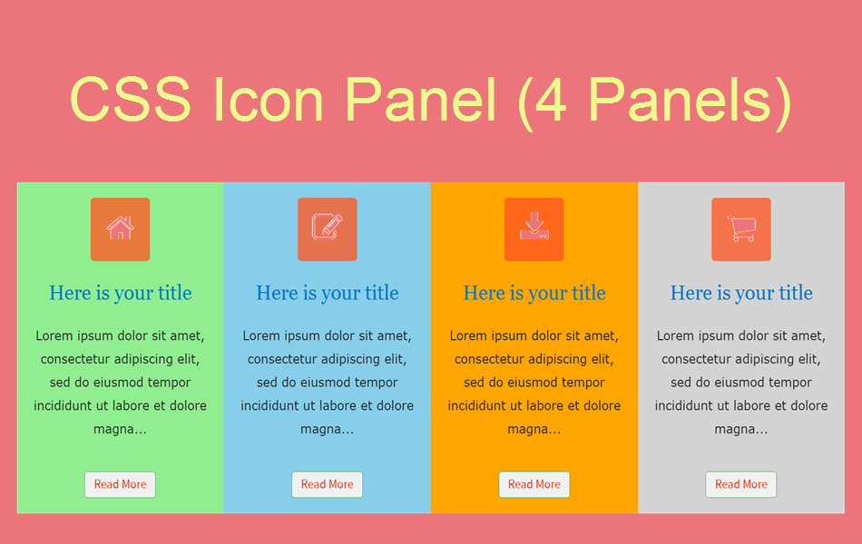
以下是四列图标面板小部件的完整 HTML 代码:
<div class="panel_container">
<div class="c1">
<div class="icon"><span class="fa fa-home"></span></div>
<h3 class="heading">Here is your title</h3>
<p class="para">Lorem ipsum dolor sit amet, consectetur adipiscing elit, sed do eiusmod tempor incididunt ut labore et dolore magna...</p>
<div class="btn"><a href="#">Read More</a></div>
</div>
<div class="c2">
<div class="icon"><span class="fa fa-pencil-square-o"></span></div>
<h3 class="heading">Here is your title</h3>
<p class="para">Lorem ipsum dolor sit amet, consectetur adipiscing elit...</p>
<div class="btn"><a href="#">Read More</a></div>
</div>
<div class="c3">
<div class="icon"><span class="fa fa-download"></span></div>
<h3 class="heading">Here is your title</h3>
<p class="para">Lorem ipsum dolor sit amet, consectetur adipiscing elit, sed do...</p>
<div class="btn"><a href="#">Read More</a></div>
</div>
<div class="c4">
<div class="icon"><span class="fa fa-shopping-cart"></span></div>
<h3 class="heading">Here is your title</h3>
<p class="para">Lorem ipsum dolor sit amet, consectetur adipiscing elit, sed do eiusmod tempor incididunt ut labore et dolore magna...</p>
<div class="btn"><a href="#">Read More</a></div>
</div>
</div>
默认情况下,小部件的列之间没有空格,您可以提供右边距以在列之间创建间隙。
.c1, .c2, .c3, .c4{
float: left;
padding: 20px;
width: 22%;
margin-right: 20px; /* Add right margin to create space between panels */
}
您可以使用具有不同变化的单个、两个、三个或四个面板。