如何在Weebly站点中添加和自定义按钮
Weebly建站网站上的按钮是用于号召性用语的重要元素之一。 例如,您可以添加一个请求用户下载 PDF 文档的按钮。 由于 Weebly 的主题数量非常少,因此您可能喜欢整个主题但该主题上的按钮可能具有侵入式风格是一个常见问题。 在这种情况下,很容易将默认 Weebly 按钮元素的样式替换为您自己的自定义 CSS 或其他主题的按钮样式。 本文解释了自定义默认 Weebly 按钮元素的可能性。
推荐:如何创建免费的Weebly移动网站
添加默认按钮元素
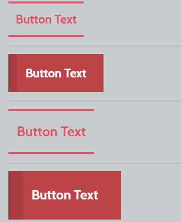
Weebly 默认提供拖放按钮元素,可以自定义为四种不同类型。 按钮元素被分组在元素的“结构”类别下。 默认情况下,用户可以添加两种样式的小按钮和两种样式的大按钮。
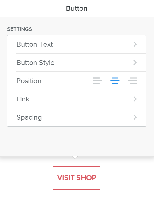
在所有非响应式主题上,Weebly建站使用图像创建按钮,在所有响应式主题上,按钮的样式由“main.less”文件控制。 拖放后,单击内容区域上的按钮以查看以下自定义选项:
- Button Text – 要在按钮上显示的文本。
- 按钮样式 – 选择四种可用样式中的一种。
- 位置 – 按钮的居中、右对齐或左对齐。
- 链接 – 添加到按钮文本的链接。
- 间距 – 调整顶部和底部边距。
除了拖放按钮元素,Weebly 还在登录页面模板上提供了一个号召性用语按钮。
替换或修改“main.less”下的按钮样式,以使用响应式主题自定义您的 Weebly 网站上的按钮。
响应式与非响应式
在尝试更改按钮的样式之前,请检查您当前使用的主题类型。 Weebly 主题使用了三种类型的按钮:
- 响应式主题上的 CSS 按钮——例如主题 Slick、Cento。
- 非响应主题上的 CSS 按钮 – 示例主题 Cleancut。
- 非响应主题上的图像按钮——例如主题城市。
带有图像按钮的非响应式主题 – 这里的按钮元素使用图像,CSS 只是将此图像称为背景,示例主题是城市。
带有 CSS 按钮的非响应式主题 – 像 Cleancut 这样的主题使用没有图像的完整 CSS 按钮,尽管它是一个非响应式主题。
响应式主题 – 所有最新的主题,如 Slick、Cento、Paper 等都是完全响应式的,并且按钮元素是从 CSS 代码生成的。
我们将讨论如何在响应式和非响应式主题上更改按钮的样式。
案例 1 – 在非响应主题上添加自定义按钮图像
Weebly建站按钮元素的重要特征是它能够适应文本的长度。 该按钮将根据输入文本的长度自动调整。 这是通过将按钮分成两个图像来实现的。 在继续之前,请按照以下步骤了解按钮图像存储在 Weebly 站点中的位置。
- 登录到您的 Weebly 帐户并选择要编辑的站点。
- 导航 ”主题” 选项卡,然后单击“编辑 HTML / CSS“ 按钮。
- 在下面 ”资产”部分,您将看到不同的按钮图像,如下所示:
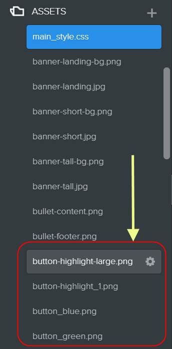
我们注意到所有使用按钮图像的非响应式主题都有 9 组图像(总共 18 个)用于更小和更大的按钮,但在 CSS 中使用 2 个特定图像作为按钮的背景。 查看 ”main_style.css”并找出用于按钮的图像是什么。 下面关于城市主题的示例显示“button-highlight.png”和“button-highlight-large.png”分别用于较小和较大的按钮。
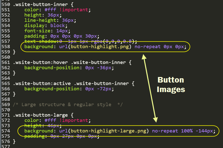
如果您不喜欢这些按钮,只需将图像更改为 9 组中的可用图像之一。 您将“button-highlight.png”更改为“button-purple.png”。 如果您不喜欢任何现有的按钮图像,请创建您自己的具有相似尺寸和拆分样式的自定义图像,并将其上传到“资产“ 部分。 确保在“main_style.css“ 为了 ”背景“ 财产。
案例 2 – 在非响应主题上自定义 CSS 按钮
如果您在“资产” 非响应主题的部分,然后检查“main_style.css” 以查看“纽扣“ 部分。 下面是 Cleancut 主题的 CSS 代码,可以根据需要自定义背景、颜色、悬停效果等。
/* Buttons
--------------------------------------------------------------------------------*/

/* Small structure & regular style */

.wsite-button {
background: red;
background: -moz-linear-gradient(top,#444 0,#333 100%);
background: -webkit-gradient(linear,left top,left bottom,color-stop(0,#444),color-stop(100%,#333));
background: -webkit-linear-gradient(top,#444 0,#333 100%);
background: -o-linear-gradient(top,#444 0,#333 100%);
background: -ms-linear-gradient(top,#444 0,#333 100%);
background: linear-gradient(top,#444 0,#333 100%);
border: 1px solid #000;
box-shadow:inset 0 0 15px rgba(0,0,0,0.25);
-moz-border-radius: 3px;
border-radius: 3px;
color: white !important;
font-size: 13px;
font-weight: 700;
padding: 3px 25px;
text-align: center;
text-decoration: none !important;
text-shadow: 0px -1px 1px rgba(0,0,0,0.7);
}

.wsite-button:hover {
background-position:0 0;
box-shadow:0 1px 4px rgba(0,0,0,0.3);
}

.wsite-button:active {
background-position:0 0;
}

.wsite-button-inner {
color: #fff !important;
padding:0;
background: none;
}

.wsite-button:hover .wsite-button-inner {
background:none;
}

.wsite-button:active {
padding:4px 25px 2px;
}

/* Large structure & regular style */

.wsite-button-large .wsite-button-inner {
font-size:14px;
padding:0;
}
.wsite-button-large .wsite-button-inner {
background: none;
}

/* Highlighted styles */

.wsite-button-highlight, .wsite-button-large.wsite-button-highlight {
background: #0370EA;
background: -moz-linear-gradient(top,#0370EA 0,#0370EA 100%);
background: -webkit-gradient(linear,left top,left bottom,color-stop(0,#0370EA),color-stop(100%,#0370EA));
background: -webkit-linear-gradient(top,#0370EA 0,#0370EA 100%);
background: -o-linear-gradient(top,#0370EA 0,#0370EA 100%);
background: -ms-linear-gradient(top,#0370EA 0,#0370EA 100%);
background: linear-gradient(top,#0370EA 0,#0370EA 100%);
border: 1px solid #0052ad;
box-shadow:inset 0 0 18px rgba(0,0,0,0.02);
}

.wsite-button-highlight:hover , .wsite-button-large.wsite-button-highlight:hover {
box-shadow:0 1px 4px rgba(0,0,0,0.3);
}

.wsite-button-highlight .wsite-button-inner {
background-image: none;
}

.wsite-button-large.wsite-button-highlight .wsite-button-inner {
background-image: none;
}
现在返回编辑器并将按钮元素拖到内容区域。 您可以看到按钮将采用您在“main.less“。
案例 3 – 在响应式主题上自定义 Weebly 按钮
所有最新的 Weebly 主题都是响应式的,并且仅使用 CSS 代码来生成按钮。 如上所述,相关的 CSS 按钮样式定义在“main.less” 文件在“/* 纽扣*/“ 部分。 如果您的主题在 CSS 中使用 @import 函数,请检查 CSS 的相应按钮文件。 这里需要将这些代码替换为自己自定义的 CSS 按钮代码来改变默认的按钮样式。
下面是 Weebly 按钮的 CSS 样式定义:
- .wsite-button – 小按钮
- .wsite-button:hover – 小按钮的悬停效果
- .wsite-button:active – 单击小按钮时的效果
- .wsite-button-inner – 定义内部元素样式,如字体大小和颜色
同样较大的按钮将使用 .wiste-button-large CSS 类。
注意 如果您的网站上添加了博客页面,某些主题可能会为博客文章上的按钮添加额外的 CSS 类 .blog-button。
您可以自行修改这些 CSS 代码或使用任何在线 CSS 按钮生成器工具来获取所需的 CSS。 例如,Weebly建站通过将默认的小按钮代码替换为以下 CSS 代码,可以使用渐变来更改小按钮样式:
.wsite-button {
border-top: 1px solid #96d1f8;
background: #6594d6;
background: -webkit-gradient(linear, left top, left bottom, from(#7a3e9c), to(#6594d6));
background: -webkit-linear-gradient(top, #7a3e9c, #6594d6);
background: -moz-linear-gradient(top, #7a3e9c, #6594d6);
background: -ms-linear-gradient(top, #7a3e9c, #6594d6);
background: -o-linear-gradient(top, #7a3e9c, #6594d6);
padding: 14.5px 29px;
-webkit-border-radius: 39px;
-moz-border-radius: 39px;
border-radius: 39px;
-webkit-box-shadow: rgba(0,0,0,1) 0 1px 0;
-moz-box-shadow: rgba(0,0,0,1) 0 1px 0;
box-shadow: rgba(0,0,0,1) 0 1px 0;
text-shadow: rgba(0,0,0,.4) 0 1px 0;
color: white;
font-size: 24px;
font-family: 'Lucida Grande', Helvetica, Arial, Sans-Serif;
text-decoration: none;
vertical-align: middle;
}
.wsite-button:hover {
border-top-color: #28597a;
background: #28597a;
color: #ccc;
}
.wsite-button:active {
border-top-color: #1b435e;
background: #1b435e;
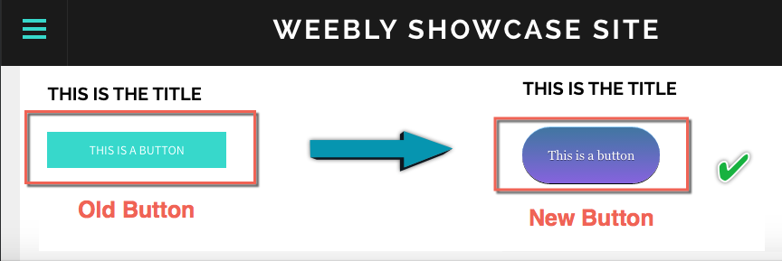
}使用新旧 CSS 代码更改按钮元素的示例主题如下所示:
注意 您可以以相同的方式更改大按钮样式。 确保更改小按钮和大按钮样式的 CSS 代码,以避免按钮在已发布站点上损坏。
为了使 Weebly 用户的任务变得简单,我们使用 Weebly CSS 类提供了三种样式的按钮。 您可以在“/*纽扣*/“你的”部分main.less” 使用以下代码之一来更改按钮的样式。
风格1:
/* Buttons */
.wsite-button,
.wsite-editor .wsite-button {
height: auto;
padding: 0;
background: none;
-webkit-transition: all 300ms ease;
-moz-transition: all 300ms ease;
-ms-transition: all 300ms ease;
-o-transition: all 300ms ease;
transition: all 300ms ease;
}
.wsite-button .wsite-button-inner,
.wsite-editor .wsite-button .wsite-button-inner {
height: auto;
padding: 8px 12px;
background: #333333;
color: #ffffff;
border: 2px solid #333333;
border-radius: 1px;
text-transform: uppercase;
letter-spacing: 0.05em;
white-space: normal;
font-family: 'Quattrocento Sans', sans-serif;
font-size: 14px;
font-weight: 700;
line-height: normal;
-webkit-transition: all 300ms ease;
-moz-transition: all 300ms ease;
-ms-transition: all 300ms ease;
-o-transition: all 300ms ease;
transition: all 300ms ease;
}
.wsite-button-large,
.wsite-editor .wsite-button-large {
background: none;
}
.wsite-button-large .wsite-button-inner,
.wsite-editor .wsite-button-large .wsite-button-inner {
padding: 12px 16px;
font-family: 'Quattrocento Sans', sans-serif;
font-size: 16px;
font-weight: 700;
line-height: normal;
}
.wsite-button:hover .wsite-button-inner {
background: #ffffff;
color: #333333;
border: 2px solid #333333;
}
.wsite-button-highlight,
.wsite-button-large.wsite-button-highlight,
.wsite-editor .wsite-button-highlight,
.wsite-editor .wsite-button-large.wsite-button-highlight {
background: none;
}
.wsite-button-highlight .wsite-button-inner,
.wsite-button-large.wsite-button-highlight .wsite-button-inner,
.wsite-editor .wsite-button-highlight .wsite-button-inner,
.wsite-editor .wsite-button-large.wsite-button-highlight .wsite-button-inner {
background: #b9b9b9;
color: #ffffff;
border: 2px solid #b9b9b9;
}
.wsite-button-highlight:hover .wsite-button-inner,
.wsite-button-large.wsite-button-highlight:hover .wsite-button-inner {
background: #a1a1a1;
border: 2px solid #a1a1a1;
}
风格2:
/* Buttons */
.wsite-button,
.wsite-editor .wsite-button {
height: auto;
padding: 0;
background: none;
}
.wsite-button .wsite-button-inner,
.wsite-editor .wsite-button .wsite-button-inner {
height: auto;
padding: 10px 16px;
background: #35A89A;
color: white;
border-radius: 0;
text-transform: uppercase;
letter-spacing: .07em;
font-family: 'Roboto', sans-serif;
font-size: 14px;
font-weight: 500;
line-height: normal;
-webkit-transition: all 350ms ease-in;
-moz-transition: all 350ms ease-in;
-ms-transition: all 350ms ease-in;
-o-transition: all 350ms ease-in;
transition: all 350ms ease-in;
}
.wsite-button-large {
background: none;
}
.wsite-button-large .wsite-button-inner {
padding: 12px 20px;
font-family: 'Roboto', sans-serif;
font-size: 16px;
font-weight: 500;
line-height: normal;
}
.wsite-button:hover .wsite-button-inner {
background: #177267;
}
.wsite-button-highlight,
.wsite-button-large.wsite-button-highlight,
.wsite-editor .wsite-button-highlight,
.wsite-editor .wsite-button-large.wsite-button-highlight {
background: none;
}
.wsite-button-highlight .wsite-button-inner,
.wsite-button-large.wsite-button-highlight .wsite-button-inner,
.wsite-editor .wsite-button-highlight .wsite-button-inner,
.wsite-editor .wsite-button-large.wsite-button-highlight .wsite-button-inner {
background: white;
color: #35A89A;
border: 2px solid #35A89A;
}
.wsite-button-highlight:hover .wsite-button-inner,
.wsite-button-large.wsite-button-highlight:hover .wsite-button-inner {
background: #35A89A;
color: white;
}
风格3:
/* Buttons */
.wsite-button,
.wsite-editor .wsite-button {
display: inline-block;
height: auto;
padding: 0;
background: none;
}
.wsite-button:focus,
.wsite-editor .wsite-button:focus {
outline: none;
}
.wsite-button .wsite-button-inner,
.wsite-editor .wsite-button .wsite-button-inner {
display: inline-block;
height: auto;
padding: 8px 16px;
background: #a1a1a1;
color: white !important;
border: 2px solid #a1a1a1;
border-radius: 2px;
text-transform: uppercase;
letter-spacing: 0.05em;
white-space: normal;
font-family: 'Open Sans', sans-serif;
font-size: 13px;
font-weight: 400;
line-height: normal;
-webkit-transition: all 500ms ease;
-moz-transition: all 500ms ease;
-ms-transition: all 500ms ease;
-o-transition: all 500ms ease;
transition: all 500ms ease;
}
.wsite-button-large,
.wsite-editor .wsite-button-large {
display: inline-block;
height: auto;
padding: 0;
background: none;
-webkit-transition: all 300ms ease;
-moz-transition: all 300ms ease;
-ms-transition: all 300ms ease;
-o-transition: all 300ms ease;
transition: all 300ms ease;
}
.wsite-button-large .wsite-button-inner,
.wsite-editor .wsite-button-large .wsite-button-inner {
display: inline-block;
height: auto;
padding: 12px 24px;
background: #a1a1a1;
color: white !important;
border: 2px solid #a1a1a1;
border-radius: 2px;
text-transform: uppercase;
letter-spacing: 0.05em;
white-space: normal;
font-family: 'Open Sans', sans-serif;
font-size: 15px;
font-weight: 400;
line-height: normal;
-webkit-transition: all 500ms ease;
-moz-transition: all 500ms ease;
-ms-transition: all 500ms ease;
-o-transition: all 500ms ease;
transition: all 500ms ease;
}
.wsite-button:hover .wsite-button-inner,
.wsite-button-large:hover .wsite-button-inner {
background: transparent;
color: #a1a1a1 !important;
}
.wsite-button-highlight,
.wsite-button-large.wsite-button-highlight,
.wsite-editor .wsite-button-highlight,
.wsite-editor .wsite-button-large.wsite-button-highlight {
background: none;
}
.wsite-button-highlight .wsite-button-inner,
.wsite-button-large.wsite-button-highlight .wsite-button-inner,
.wsite-editor .wsite-button-highlight .wsite-button-inner,
.wsite-editor .wsite-button-large.wsite-button-highlight .wsite-button-inner {
background: transparent;
color: #808080 !important;
border: 2px solid #808080;
}
.wsite-button-highlight:hover .wsite-button-inner,
.wsite-button-large.wsite-button-highlight:hover .wsite-button-inner {
background: #808080;
color: white !important;
}
使用嵌入代码元素添加自定义 CSS 按钮
自定义现有元素是一项艰巨的任务,因为Weebly建站经常更改代码以及按钮的范围将仅限于现有样式而没有太大吸引力。 最简单最简单的方法是添加自己的自定义 CSS 按钮,而不是修改现有代码。 这为向您的 Weebly 网站添加不同类型的 2D 和 3D CSS 按钮提供了无限可能。 但问题是每次使用“嵌入代码” 具有预定义样式的元素,而不是使用“按钮“ 元素。
例如,您可以添加不同样式的渐变按钮,如下所示,通过在“嵌入代码” 元素和主样式表下的 CSS (“main_style.css” 用于非响应主题和“main.less” 用于响应式主题)。